eBuild & Construct
Project
eBuild & Construct
Industry
Building & Construction
Client
eBuild & Construct
Services
Brand evolution reflecting growth and professionalism while staying familiar for established clients.
Overview
Growth Without Losing Familiarity
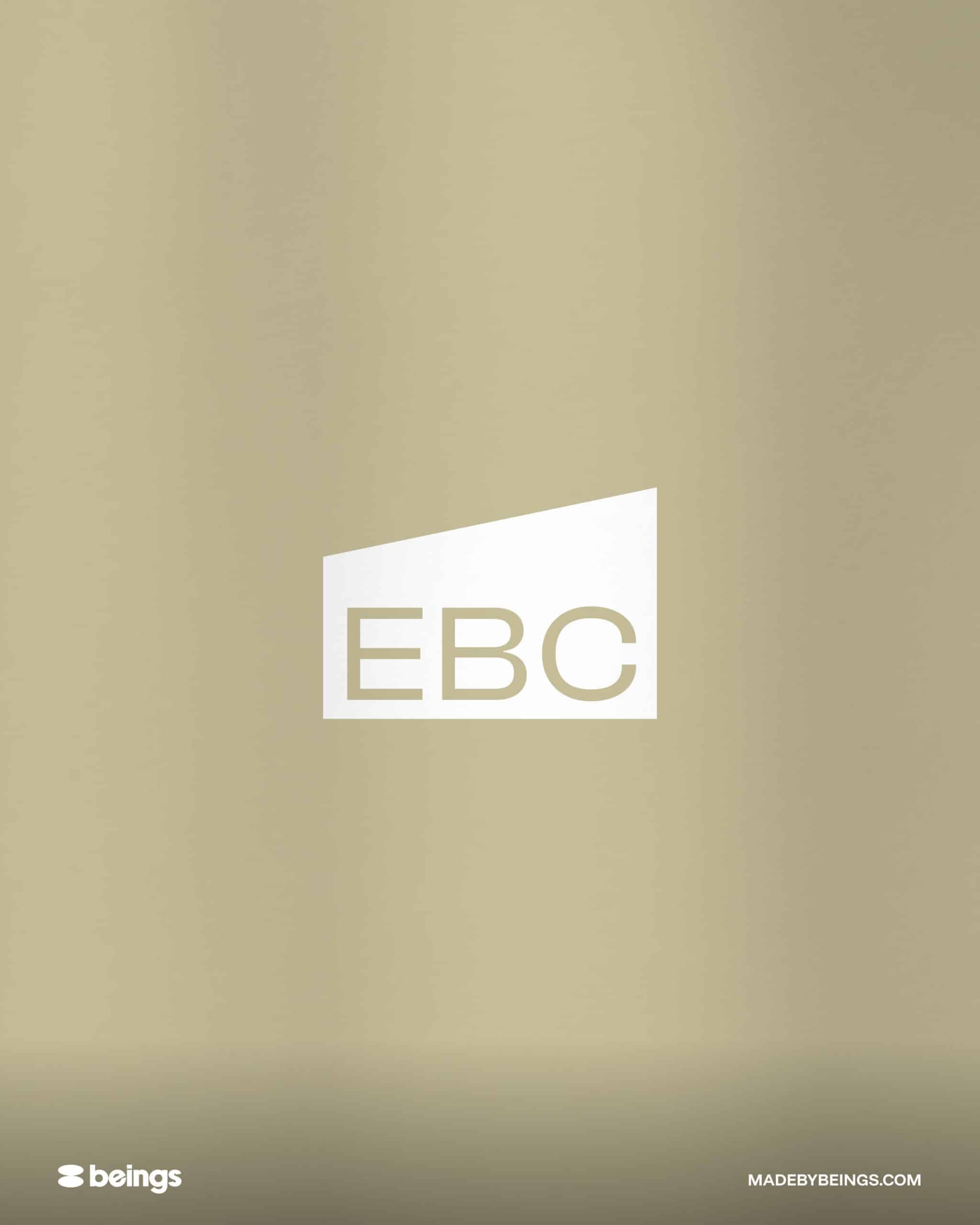
eBuild & Construct had outgrown its original identity. Rather than start again, we refined the existing mark, typography and colour palette so long-standing clients still recognise the brand.
The Project
An Identity Matched to Build Quality
eBuild & Construct had built its name on reputation and consistent work, but the identity looked younger than the business had become.
So we evolved the brand instead of replacing it. We looked at what customers already associated with the company, kept those elements and refined the mark into a cleaner, more confident form.
We simplified the typography so it reads well on signage and screens, balanced the proportions and moved the colour palette somewhere more contemporary. It is still unmistakably eBuild, just closer to the business it is now.
Impact
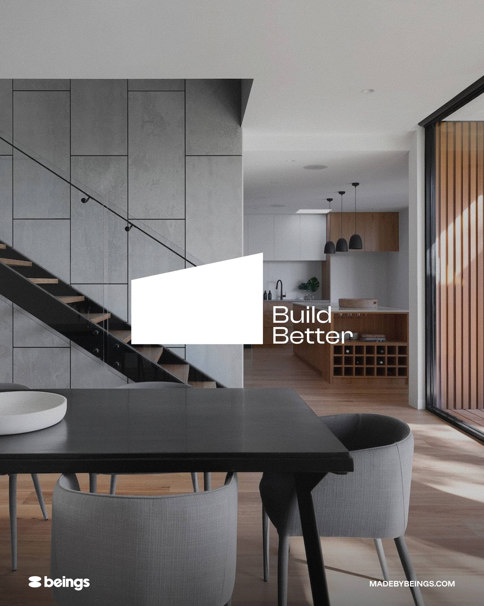
The identity now matches the standard of the work and where the business is heading.
Existing customers still recognise the brand, because the parts they knew are still there.
The system holds together on signage, online and across marketing materials.